One-Page Post-Campaign Readout Clients Actually Use
Because no one ever said, “I loved that 48-slide deck.”
📈 After the flight ends, the real story starts.

Every client wants to know: Did it work? But too often, the recap gets buried under slides, screenshots, and spreadsheets. The best readouts don’t overwhelm — they clarify. One page can tell the whole story if it’s built with purpose.
✈️ 1. Start with the flight path, not the weather report
Skip the laundry list of metrics. Lead with a simple headline:
“Here’s what we set out to do — and what happened.”
Ideally, two sentences, tops. Think narrative, not numbers.
🔍 2. Group data by story, not source
Don’t organize your report around platforms (“Meta,” “Google,” “Nextdoor”). Instead, group it around goals:
Awareness
Engagement
Conversion
Retention
That way, you’re showing strategic impact — not tactical inventory.
💡 3. Use a “Top 3 Takeaways” block
Clients rarely remember 30 numbers, but they’ll quote three insights if they’re phrased well. Example:
1️⃣ Creative A doubled CTR with clear pricing.
2️⃣ Peak engagement came from Tuesday PM posts.
3️⃣ 60% of conversions came from mobile visitors.
That’s digestible and actionable.
🪶 4. Visual > verbose
Think mini-dashboard, not data dump.
A clean 2×2 grid or a couple of progress bars says more than text-heavy slides.
Pro tip: Highlight one or two visuals that make the client feel the lift — impressions, CTR, or form fills — not every data point in your dashboard.
🔄 5. End with next flight recommendations
Never end with “Thanks!” End with momentum.
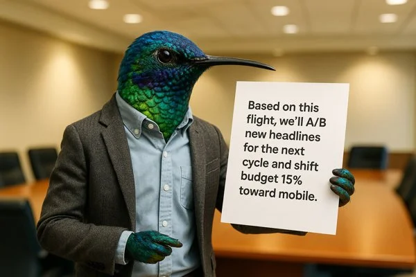
It shows partnership, not post-mortem.
🧭 Bonus: The “Whirr 7-Block Framework”
If you’re ready to simplify your recaps, use this skeleton (fits perfectly in one-two pages or slides):
1️⃣ Goal
2️⃣ Flight dates / media mix
3️⃣ Key outcomes
4️⃣ Top 3 takeaways
5️⃣ Visuals (2 max)
6️⃣ What we learned
7️⃣ What’s next